As I’m sure all of you know by now, one of my summer projects this year was painting the bedroom that was Zoe’s so that Lisey could move in.
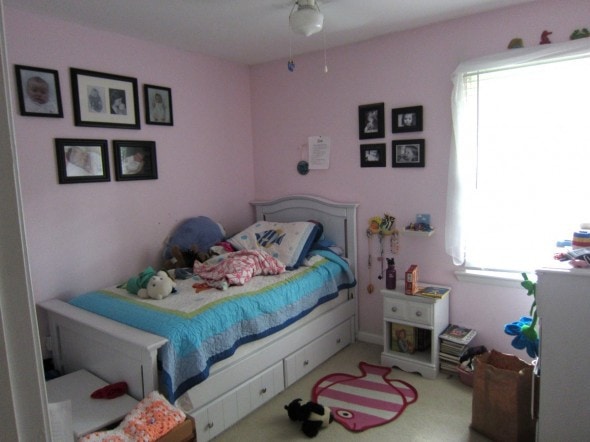
(Zoe had that bedroom for a long time because until last year, it housed a crib-turned-toddler-bed that no one but her could fit into! When we bought the twin-sized white bed and painted it (before and after photos of that project right here), we told her she could stay in that room for a year to enjoy the new bed, and then we’d move her in with Sonia so that Lisey could have her own space.)
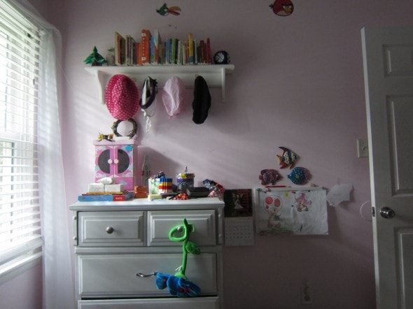
Things had gotten a little messy in here. My house slowly descends into a more cluttery state over the course of the school year (despite my best efforts to the contrary!) and then I fix it in the summer.
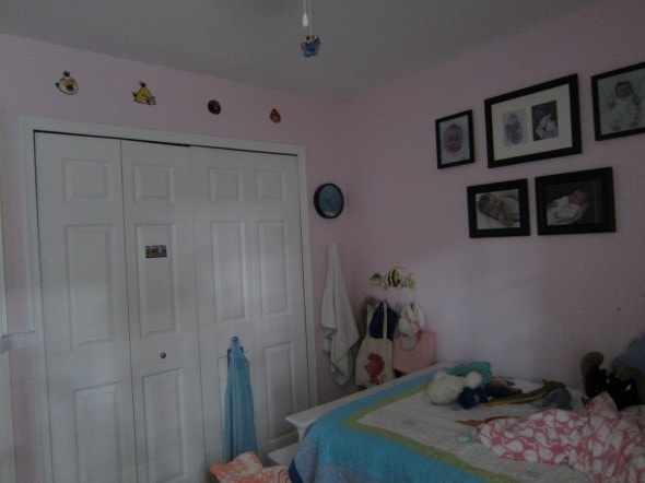
As you can see, the walls in here really were due for a coat of paint even if Lisey hadn’t disliked the pink.
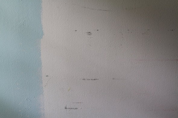
Lisey knew she wanted a shade of blue on the walls, so we picked up some samples and sorted through them.
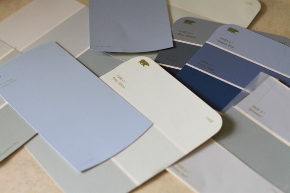
Blue is a tough color. If you want to go dark, then choosing a non-cheezy shade isn’t all that hard.
But if you want to stay on the lighter end of things, it’s tricky to avoid baby/sky blue.
(I’ve discovered that leaning toward the gray end of things like I did in my living room/dining room really helps with that.)
This is why I buy sample jars.
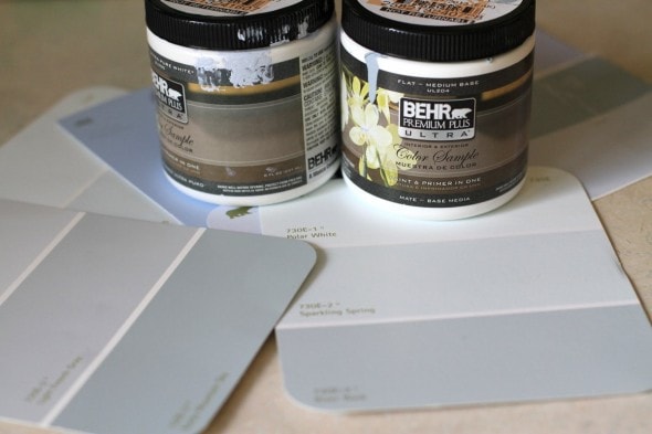
They’ve saved me from many a disastrous painting mistake.
The first color we chose was too dark, and then second color we chose was a horrible, terrible, no-good, very bad shade of sky blue. I rolled it on, looked at it, and was like, “Oh, dear heavens. If Lisey likes this color, I am going to curl up into a ball and cry.”
Fortunately, with no prompting from me, she decided it was bad, and we opted for a shade in between the two samples we tried.
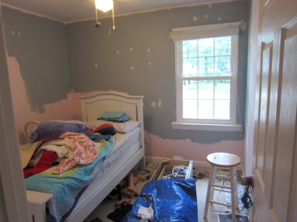
Oh, before I painted the walls, I did some prep work. As you can see in this photo, I painted the ceiling, and I did not tape the edges.
I purposely got some ceiling paint on the walls, because if you overlap one type of paint, it makes it easier to turn out a neat edge where the colors meet.
I also filled all the nail holes/gouges in the wall, used caulk to neaten up some spots where the moulding met the walls, and I repainted all of the white trim in the room (again, I didn’t tape the edges at all.)
I really hate doing prep work like that because painting on a new wall color is fun! and exciting! and repainting white trim and ceilings is so boring.
But the boring prep work really makes the end paint job look so much better.
Ok. Ready for some after photos?
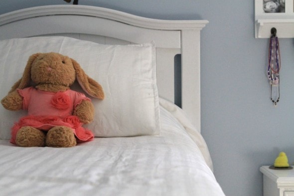
The color we chose for the walls is Silver Strand from Behr, and we got it in an eggshell finish.
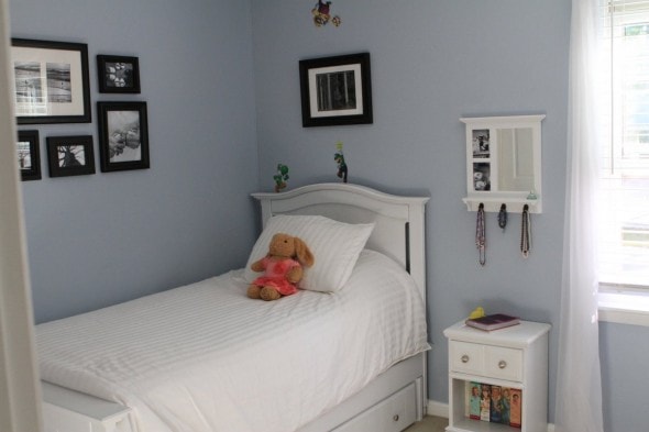
See the lovely bright white trim at the bottom of the wall? Yay!
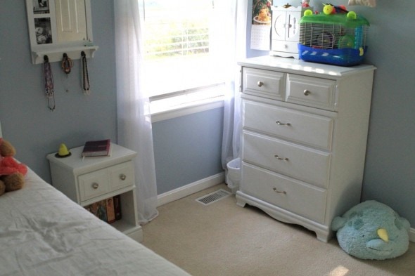
All of the furniture in here is from freecycle or Craig’s List, and I’ve painted it all myself.
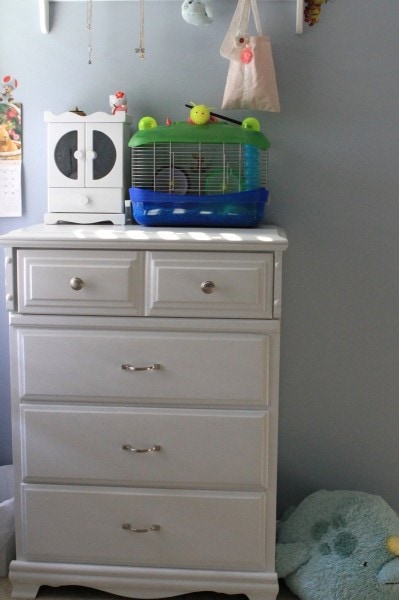
The bed was just painted last year, so it was still in pretty good shape, but the dresser, nightstand, and little chest at the end of the bed all were getting kind of dinged up, so I gave the tops a coat of paint and touched up some other spots.
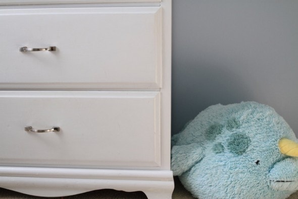
That’s a really great thing about painting your own furniture…when it gets messed up, you can fix it pretty easily.
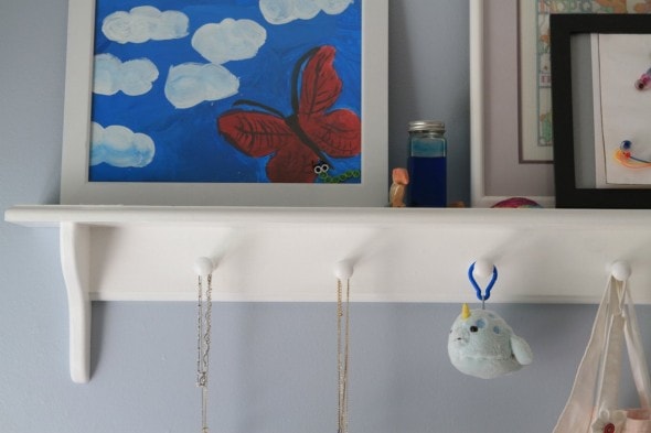
I also put a fresh coat of paint on this shelf, which we’ve had for something like 12 years.
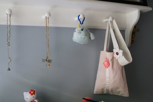
(Do you recognize the pink bag, which I made from the leftover part of a pair of cut-offs?)
The shelf used to house our board books, but now it’s holding Lisey’s things (you might recognize her framed butterfly art from this post about using old frames.)
The shelf sits above this dresser.
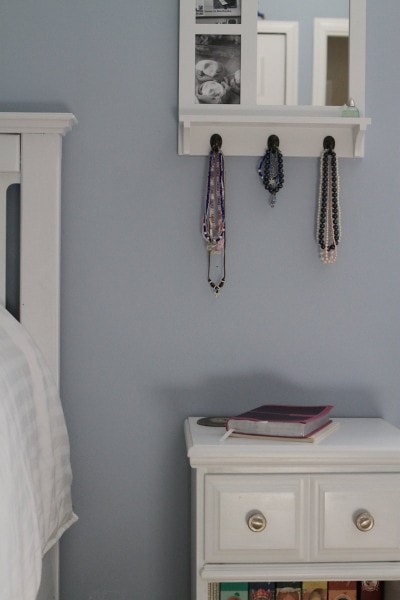
Oh, here’s a part of the room I especially love.
I bought this from Goodwill several years ago with the intention of hanging it up in what was then Lisey and Sonia’s room.
But I never quite got around to it, so it sat in my laundry room for years.
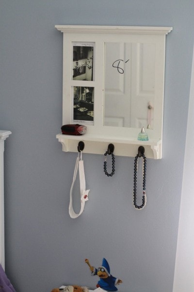
It’s sort of hard to tell in the photo, but it was a creamy shade of white, and it looked terrible in the room with all of Lisey’s white furniture.
Plus it had some dings in it.
So, I bought a can of spray paint (I used semi-gloss white from Rustoleum), took the hooks off, removed the picture glass and mirror, and turned it from cream to white.
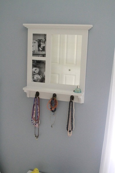
I just love all the white and blue.
Here’s the grouping of frames we came up with for her wall. I took a bunch of frames that were in this room before, laid them out on the living room floor to find a good grouping shape, and then Lisey and I looked through my picture files to find things she wanted on her wall.
The theme is basically Things That Make Lisey Happy.
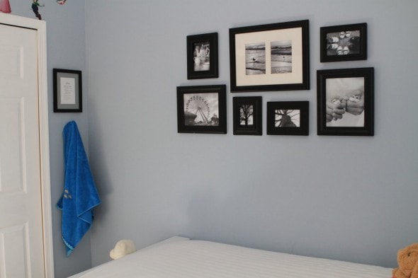
(See her framed chore list over there in the corner?)
So, there’s Myrtle Beach and Converse and afternoon tea and trees from a vacation we took in January, and of course, the hamster photos I already told you about.
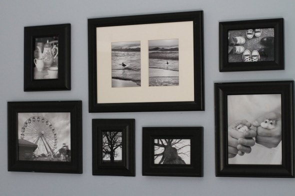
Making all the photos black and white helped to make a diverse group of subjects work together.
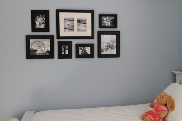
Lisey had a purple comforter when she shared a room with Sonia, and we thought it looked very not right in here (plus it was super old and worn out.)
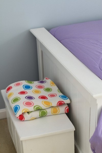
We tried to find something that would kind of coordinate with the blue walls but came up dry, and so we opted for a clean white look.
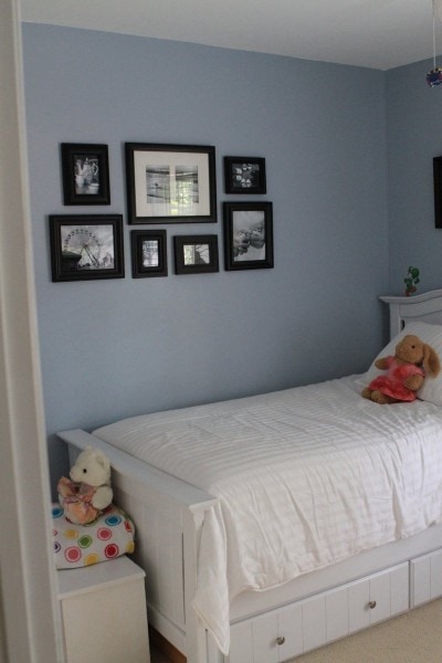
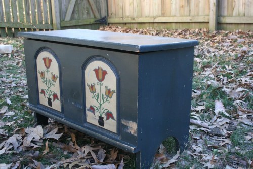
See that little chest at the end of the bed? Here’s what it used to look like.
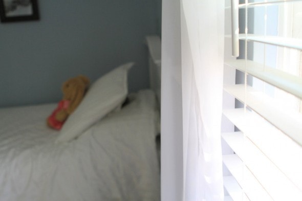
The curtains, which I had a terrible time taking a photo of, are the same as they were before.
To “make” them, I just bought sheer, drapey fabric from Jo-Anne’s and draped them over a curtain rod. Super easy and super cheap.
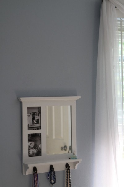
(We stuck with the theme for these two photos, by the way…homemade cinnamon rolls and Starbucks coffee make Lisey happy.)
And the blinds, which we installed last year, are Home Depot’s faux wood line, which I love.
They’re pretty inexpensive, so much more stylish than vinyl, and if you’re getting white, the faux wood look just as great as the real wood sort (the stained-wood colored ones are super cheezy, though.)
One last thing: Lisey had Mario wall stickers in her old room, and she really wanted to put them on the walls in her new room. That didn’t quite go with my vision, but I smiled and said nothing.
Not gonna lie: I considered taking them off the walls before I took these photos, but then decided against it, because this isn’t a room for a catalog…it’s a real room where a real 12-year-old lives.
And sometimes, real 12-year-olds want to put colorful Mario stickers in a room with a peaceful, classy blue and white color palette.

This room is only missing one thing…a clock. We have a super cute two-bell alarm clock on order, and it’ll go on the nightstand.
Lisey’s really happy with the way her room turned out and of course, she’s super-delighted to have her own space.
Me? I’m really happy that this project is d o n e, and I’m also kind of pleased that so many elements of the room are second-hand, reused, or DIY. Seeing it all come together is super rewarding.
P.S. I’m not affiliated with any of the companies mentioned in this post…I’m just trying to be helpful by sharing which products I used.

Tnh
Saturday 21st of September 2013
Wow, amazing job! I love the crisp blue and white and the thick black frames! I'm quite obsessed over colors, paints etc. I think you did a fabulous job choosing, with Liseys help!
Hmmm.....this color inspiration is quite similar for my fall living room redeco!
Great job ladies! Its perfect!
gabby169kitty
Wednesday 18th of September 2013
The shade of blue you ended up with is amazing! The whole room is pretty awesome. Now if it will only stay that clean.
Babs
Thursday 12th of September 2013
Wow, now you've got me started... i think my bedroom would look fantastic with the colours you have used. I think it all looks absolutely fantastic. Well done
Roc Away Debt
Tuesday 10th of September 2013
I love how grown up her room looks --- even with the Mario stickers on the wall it looks very mature for a 12 yr girl! The sliver-like blue and the white go great together!
Anjana @ At The Corner Of Happy & Harried
Tuesday 10th of September 2013
Such an amazing makeover. It is pretty, yet sophisticated enough for a young lady. Love all your DIY projects. I especially like the grouping of B&W photos. Thought he frames and subject matter differ widely, the B&W ties it all together. Amazing (did I say that already?!)!!