| As you all already know, for the last two years, I’ve been busily churning out MyPublisher photo books. I’ve been staying caught up on recent photos and also working backwards to get caught up.
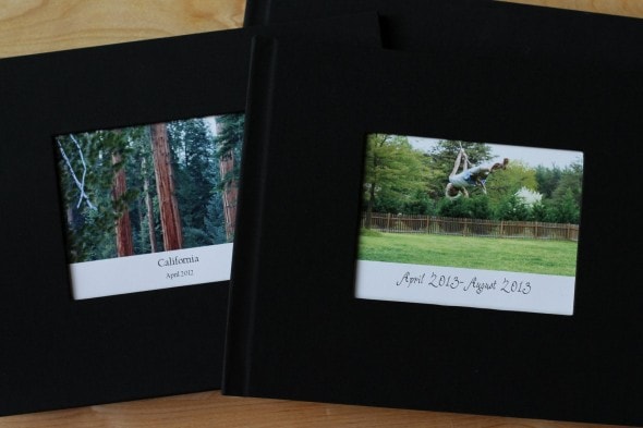
(I used to be a faithful scrapbooker, but somewhere around the time I started blogging, scrapbooking began to take a back seat. I’m thinkin’ there might be a bit more than a correlation between the two. 😉 ) Anyway, I’ve shared about my photo books several times before, and recently, MyPublisher contacted me to see if I’d be interested in working with them and also giving away some photo books to you guys. So of course, I said yes because I dearly love to work with companies I’ve faithfully patronized. I’ve made 14 MyPublisher books now (all with deals from Living Social and Groupon!), and I’ve learned a few things along the way. So, before we get to the giveaway, I thought I’d share a few tips that can make your photo books more beautiful. 1. Choose Photo Finish CoversMy first few books have the basic linen cover with a small photo in the front. These are ok, but they have a couple of downsides.
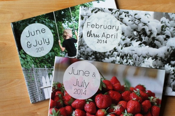
First off, they’re not super wipeable, and if you choose the black fabric, it does tend to show if you get a little something wet or dirty on it. Also, the photo on the front is fairly small. Perhaps the biggest downside, though, is that there’s no marking on the spine. So if you have a bunch of these on your bookshelf, it’ll be hard to pull out the book you want unless you choose different colors for every book. Of late, the Living Social and Groupon deals from MyPublisher have been including a photo finish cover, and once I tried that, I never looked back. Love.
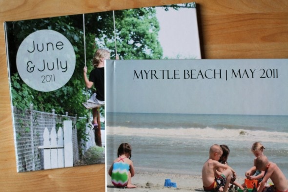
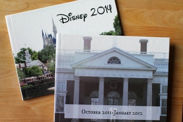
The large front and back photos are great, as is the wipeable surface and the fact that you can label the spine. (So much easier to organize the books this way!) There’s also a book jacket option, but in terms of durability, I don’t think that could possibly compete with the photo finish option. And I am all about durability. 2. Make Your Own Cover LabelsMyPublisher does offer a text tool in their software, which you can use to make a cover like the Myrtle Beach one below.
To make one like the book on the left, though, you’ll need to use some other photo editing software. I used to use Picasa, a free software from Google, but now I use PicMonkey, a web-based editing software that offers many more options. (PicMonkey does have a subscription for premium features, but the features you need to make a cover like this are all free.) I just open a photo, choose a geometric overlay and add text on top of the overlay. I then import the picture to My Publisher and use it as my cover. Sometimes, though, I still choose to put the text into an empty spot in the photo, like in the Disney book below. (I downloaded a free Disney font for that cover.)
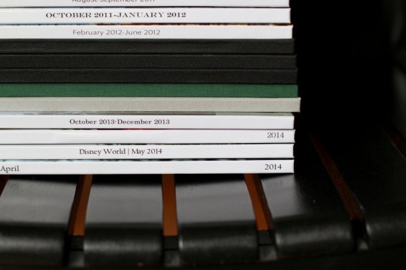
(Do you like how I put “Disney 2014”? As though we’ve gone more than 0 other times. Ha.) 3. Don’t Center Spine TextWhen I first started using photo covers, I centered my spine text. For some reason that made sense to me. (???)
But more recently I realized that putting the year on one end and the month on the other end would make it far easier to organize the books. I’m kind of annoyed with myself for not doing this right away. Oh well. At least you can learn from my mistakes! 4. Choose Neutral, Non-White Background ColorsWhen I made my first book, I didn’t realize that you could have something other than a white background.
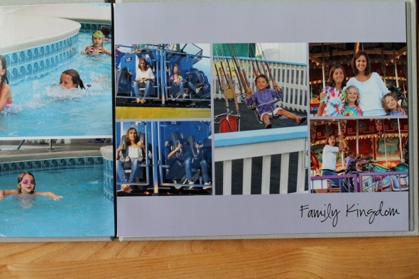
White’s ok, but it’s pretty boring. So now I usually select a neutral gray background for most of my pages.
My Publisher has some patterned backgrounds, but to be honest, most of them scream 1995 scrapbooking to me. Plus, patterns have a tendency to look pretty dated in short order, so I say stick with the solids. Your future self will thank you. 5. Fill the Page
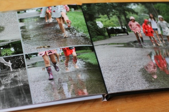
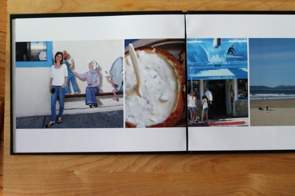
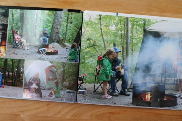
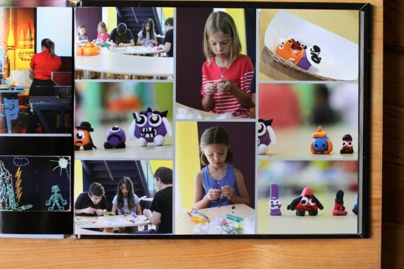
As I’ve experimented with different photo layouts, I’ve discovered that my pages usually look better if they’re mostly pictures and not much white space.
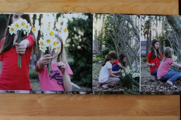
This sometimes requires cropping photos to be vertical instead of horizontal so that they fit in the layout, but results look much more professional. Also, a full page photo every now and then is better than page after page of many small photos.
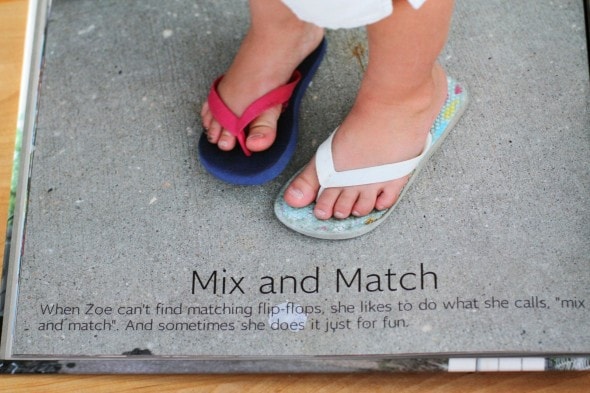
Full page photos are my favorite. I’d fill every book with them if I wasn’t trying to stay within the 20 pages that come with a daily deal! 6. Put text on photosYou can add text boxes anywhere on a page, and usually the My Publisher templates suggest putting text in between or under photos. But if you have a photo with some empty space, feel free to put a text box right on the photo, like so:
I really love the look of this when I want to add text to a page. 7. Choose Super Gloss PrintingI’ve mentioned this in previous posts, but Super Gloss printing is so, so, so much better than the matte option. With Super Gloss, the colors are better, the print quality is better, and the pages are thicker and stronger. The GiveawayAre you inspired to make a book?? Good, because five of you are going to win a free one! (And as long as MyPublisher ships to your country, you can enter.) You’ll get: -a Free 20-page Classic photo book (that’s the size I make) That’s a $56.98 value, so this is pretty stinking awesome. To enter, leave a comment telling me what photos you’ll put into your My Publisher book. The giveaway will close on Sunday, October 5th, so get your entry in now! NO PURCHASE NECESSARY. Void where prohibited. Chances of winning depend upon the number of entrants. Winner will be randomly chosen at close of giveaway. The giveaway will close on Sunday, October 5th, at 11:59 PM EST. This post is sponsored by MyPublisher. All opinions, text, and photos are my own. All of my own MyPublisher books have been purchased by me. |

Carolyn Milton
Friday 4th of October 2019
I want to try and make a book for our granddaughters with pictures from a vacation we had in June at our cabin - I think they will love having a permanent record of our time together!
Pamela Lauder
Thursday 16th of March 2017
Hi Kristen
I have just read your fantastic blog on My Publisher. I understand they are closing down on 8 May 2017. My friend and I have produced 2 photobooks and now we want to print extra copies of one of the projects making just a few changes. We want to take advantage of the special they have going at the moment e.g 40% off. I can't find anywhere where a project that has been completed and printed can be upload and edited to be reused. Other programs I have used you can do this but it looks like My Publisher doesn't have that option. Would you have any suggestions other than doing the book again.
Thanks heaps! Pamela
Kristen
Thursday 16th of March 2017
Hi! I don't think there's a way to upload a photo book to MyPublisher if you've made it in another software program.
If you originally made the book with MyPublisher, though, it should still be there in your account, and you can order more copies very easily.
marie
Friday 10th of February 2017
MyPublisher is shutting down! Any advice on how to save the work to be able to print more copies in the future? I've worked too hard to lose all my work! They will provide a digital copy but I don't know how I'll be able to print it in the future. Any advice on how to save my work now so that I can print it in the future with other software???
Kristen
Friday 10th of February 2017
I'm really not sure! I just got that email this morning too.
I'd go ahead and print whatever copies you want now because there's no guarantee the printing service will work anywhere else in the future with your digital copy.
Joyce Garner
Sunday 28th of August 2016
I love My Publisher photo books! I lost count of the books I have created with them. Thanks for your tip on the glossy prints.
Jim
Sunday 28th of August 2016
FANTASTIC advice! My wife has been an art teacher for 21 years and has 2nd grade this year. I am a photographer so I would use the book by taking photographs all year of her students working on art projects as well as the District art show. I think she would love the chronological record as well as the memories it would carry of each student. Keep up the great work!