(Note: please excuse the not-great photos…it was a dark and stormy day yesterday!)
Sonia and Zoe’s curtains arrived two days ago, so yesterday, I put them up. I was pretty sure I was gonna need to raise the rod height, and once I put the curtains up, that was confirmed.
I think this looks awkwardly low.
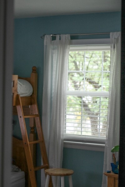
Having read in multiple places that curtains should be hung high, high, high, I did just that.
Oh dear.
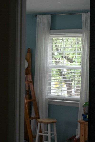
While this might work if you had roman shades or bamboo blinds to cover the empty wall space, in this application, I did not feel like it worked.
So, I tried something more in the middle. I think this is much better, and it does make the room seem to have more height without looking completely ridiculous.
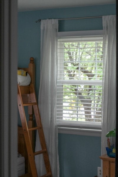
I’m wondering if these are still too high, though. Or are they too low? I don’t know! What do you guys think?
While I was busy hanging curtain rods, I decided to tackle the ones in my living room, which I felt were a little too low.
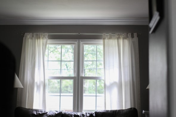
Scarred from my too-high attempt in the girls’ room, I opted to play it a little safe here and raise them just a few inches, and I actually really like this height!
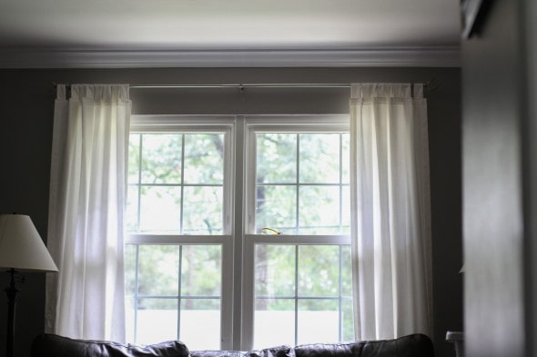
The curtains are now too short, but this doesn’t matter because they are completely hidden behind the sofa.
Eeeeeexcellent.
Also: I am totally giving myself props because I filled, sanded, and painted the old holes in the living room wall within a few hours.
(This is a job I might be tempted to procrastinate on!)
And in Sonia and Zoe’s room, I did fill in all the old holes, but I ran out of time to sand and paint ’em. That’ll happen today.
And because I painted their chalkboard wall yesterday, I can take after pictures of their room very shortly. Yay!!!
So, decorating-savvy people! Give me your thoughts on curtain height. Do you think the higher, the better? Is the height I hung the curtains at ok?
__________________________

Jacqueline
Saturday 22nd of August 2015
Love how the living room looks. As for the bedroom, I think I'm with most of the other commenters: do what works for you. I think I'd go for the middle one.
Rachel
Friday 21st of August 2015
I like the last position, right in the middle! The living room looks great too!
Kris
Friday 21st of August 2015
Whenever I have a decorating or design dilemma, I head to a couple of different places--thistlewoodfarm.com and missmustardseed.com. They are both down-to-earth people and brilliant at coming up with beautiful design solutions that are economical and do-able. Along those lines, here's another thought for you--it might be wrong for your home, but it's something to think about. http://www.thistlewoodfarms.com/what-about-that-space-over-the-window
Karianne at Thistlewoodfarms is very good about getting back with you regarding questions you may have. I haven't tried it with Marian at Missmustardseed.
Kristen
Friday 21st of August 2015
Oh wow...what a BEAUTIFUL way to cover up that space. A little fancy for my girls' room, but I love it!!
Millicent Borges Accardi
Friday 21st of August 2015
I'm not a decorator or a home-maker type so take this with a grain of salt. Our walls are white and have not been re-painted in 15 years. . .but here's my comment about curtain rod height. The curtain rods that we DO have I got at Target for like $10 and the curtains cost even less than that. I put the rods RIGHT on the top of the window frame. It never occurred to me to put the rod on the wall! I guess I took my lead from our dining room (where my mother in law made our curtains) and they are on the front door and two side windows that open OUT, thus the curtain rods HAVE to be ON the window frame itself for the door and windows to work properly.
jenny_o
Sunday 23rd of August 2015
Actually, what Millicent describes is the way all our drapes and curtains were installed - made to order and put up by the "experts". Mind you, that was 25 years ago, so the "in" thing is probably different now. But that leads to another point, one that numerous commenters have made: there really is no "right" way, just the way that looks nice to you. For the record, I like the way you ended up leaving them, right in the middle. It just looks right to my eye (and that's the criteria I'd use, what looks right to your eye).
By the way, you are a powerhouse at getting things done, Kristen! You are inspiring.
Kristen
Friday 21st of August 2015
Oh, interesting! I've never seen a window designed like that, but yeah, that would seriously limit your window covering options.
Diane C
Friday 21st of August 2015
My vote is for exactly where they are now, but then my house has no curtains at all, so consider the source... I can't wait to see the after pictures!